I am back screen printing in Birmingham after spending a few days at the first Brighton Print Fair
which was held in the Phoenix Brighton. It was organised & curated by Tutton & Young who did an amazing job of publicising the fair as well as all the individual exhibitors. The exhibition
style format & display of unframed work suited my screen prints
just fine. It was great to be part of such an exciting show & to
exhibit my work alongside so many printmakers I admire. www.brightonartfair.co.uk
There was alot of work at the print fair which I am already familiar with including Belinda Chen's wonderful screen prints. Belinda was exhibiting as part of East London Printmakers where she prints her work. I've been a fan of her illustration & printmaking since seeing it when we both exhibited at the 'Handmade and Bound' artists' book fair many years ago. Her screen prints are so colourful, imaginative & full of detail! www.belsartworld.com
I also love Jane Walker's reduction lino prints & it was a real treat to see an entire collection of them displayed together. I am drawn to the uniformity of her designs & the perfection of her printmaking. I like shininess of the inks as well as how smooth & flat the blocks of colour are. I was very lucky to meet Jane at the print fair & find out a little bit more about her work. www.janewalkerprintmaker.com
It was good to see such a variety of relief printing at the fair. I have only recently come across Bernard Lodge's lino cuts & wood cuts & the fair was a chance to see them close up. He has a very distinctive style & his prints are so unique. I love the bold graphic shapes, striking colour combinations & transparency of the inks. bernardlodge.moonfruit.com
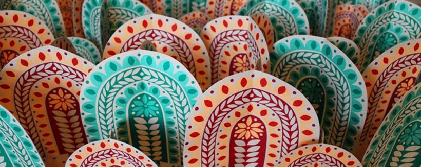
Another relief printer whose work really stood out was Teresa Winchester. I've not seen her prints before & thought they looked stunning displayed on the black walls of the Phoenix. Her work has such a magical quality. I like the bold animal & bird characters combined with floral & foliage patterns against bright coloured backgrounds.www.teresawinchester.co.uk
Alongside
the print fair there were printmaking workshops running
at the Phoenix. I booked a place on Jane Sampson's three colour
monoprint workshop. It was a great opportunity to learn from a
professional printmaker. I really enjoyed the technique Jane taught us
& I picked up some good tips. I even managed to avoid mark making
for the entire session by using paper shapes instead of drawing! I would
love to do another of Jane's workshops & also visit Ink Spot Press, the
print studio she runs in Brighton. www.inkspotpress.co.uk
I enjoyed my time at Brighton Print Fair & was sad when it was over but I felt like I had made the most of the experience. I was impressed with how well organised & publicised the fair was & from what I saw there were lots of enthusiastic visitors. I hope Tutton & Young decide to put on a second Brighton Print Fair! www.tuttonandyoung.co.uk
Screen printing these limited edition three colour 'Autumn Sunshine' prints turned out to be more difficult than I anticipated. Often I don't realise there's something wrong with a design until I've printed it. After the first attempt at 'Autumn Sunshine' I had to tweak the artwork, reprint the positives, re-coat & expose screens & mix new colours before printing more sunshines. Unfortunately I wasn't happy with the second attempt either so this one is actually my third! I think it was probably the pressure of creating new work for both Oxford & Brighton Print Fairs. I rushed & didn't do things properly which ended up costing me time & money.
After
working on the commission for Handsworth Park Arts Trail I had just
three weeks to get ready for the Autumn season of print fairs. The
sunshine design I created for the commission got such a positive
response when posted on social media I wanted to develop it to use for
new prints. I'd been away from the printroom for almost a month so was feeling out of practice. I decided to start with the easiest prints first; some one colour A4 screen prints & two colour A6 greetings cards. It was good to be printing new work at last even though I did make mistakes!
Summer was busy with workshops so it was nice to end it by working on something completely different. I was asked to create a design to be installed outside on a large plinth as part of Handsworth Park Arts Trail. The other criteria was that the design should be based on the wheel of the year so it had to show each season as well the text 'Handsworth Park, Beautiful All Year Round'. Luckily I know someone who prints vinyl wraps for exteriors so this was a great opportunity for me to work BIGGER & with digital print rather than screen print. I was able to incorporate many of my usual folk art elements. Aswell as creating new motifs especially for the commission I was also able to create new ones. The sunshine, trees, fox, butterfly & bird were drawn especially for the design but everything else had been previously used. Look carefully & you will see a familiar owl, hegdehog & rabbit!
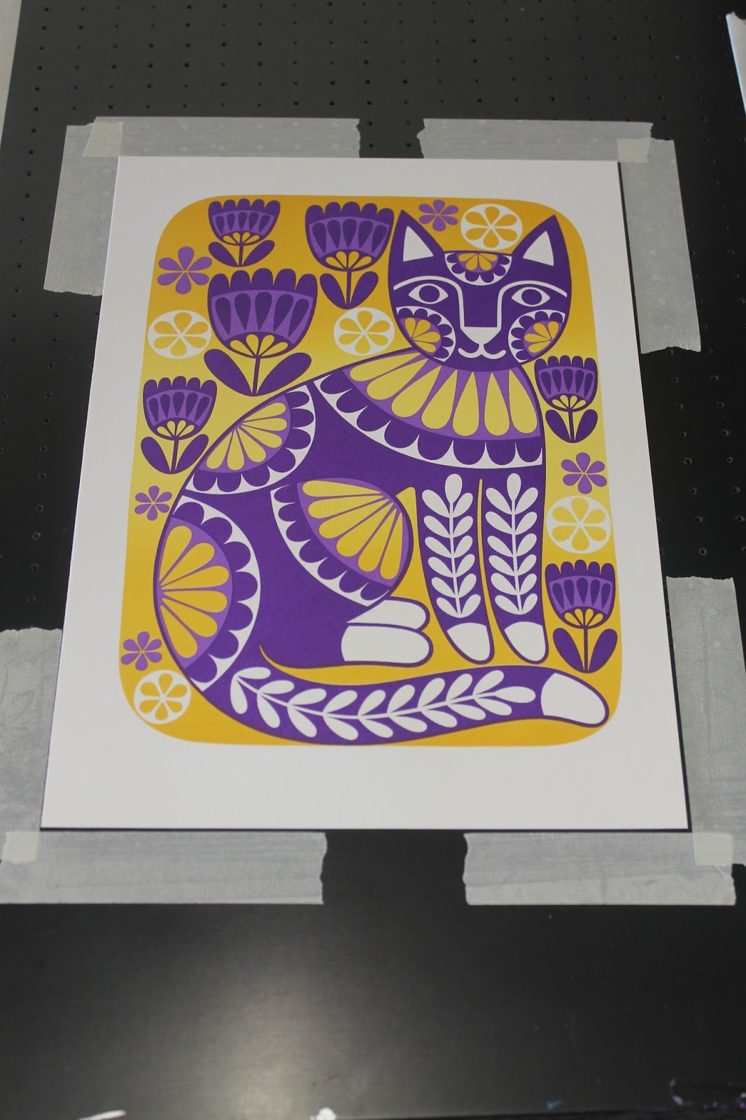
I was surprised by how much I liked the metallic purple & yellow cat cards so I decided to take a risk & screen print a small edition of 20 A4 prints. As with all of my recent screen prints I used a gradient for the background which was fairly straight forward. The purple was harder & it took a few attempts before I got the two different shades right; they were either too dark or too light. The cats have turned out to be one of my favourite prints & they always cheer me up. I love the bold patterns & bright clashing colours! It's an added bonus that other people also like them, I'm happy that both the cards & screen prints have been selling well.