Thursday 25 October 2012

Shiny New Christmas Cards


Despite spending so much time on buses, trams and trains lately, traveling to various parts of the country to deliver framed prints for different exhibitions, I've managed to get a new card design finished and screen printed just in time for Christmas. Hopefully the cards will make it to a few of my favorite shops, galleries and craft fairs. I'm not sure if the colours are particularly festive but I wanted to try something different and also use the metallic purple acrylic which has been at the bottom of my box of screen printing supplies for a long long time. The metallic ink shows up well on the eco natural cards but I really like it on the brown kraft cards. This time I used A6 recycled card blanks and envelopes from 'Docrafts' which are about £5 for 50 so seem like good value for money. The brown kraft card blanks are from Fred Aldous in Manchester, it's a great art shop and definitely worth a visit.

Folk Tree Window Installation


Ok, so I might have gone a little bit overboard with the Folk Trees but I really enjoyed creating this installation and little exhibition of my work for The Red Door Gallery. Admittedly it did involve a lot of late nights spent folding, glueing and cutting out little card trees. And the vinyls were a nightmare to install but no pain no gain as they say. It was a great opportunity to be able to finally show the whole series of Folk Tree screen prints together.


New Cards for Autumn


With alot of overtime in the print-room I managed to get a batch of new cards screen printed and ready for autumn as well as to take to Scotland for my little exhibition at The Red Door Gallery. As with all my cards I used recycled card but at the moment I particularly like eco natural and brown kraft. They really do look recycled which is probably down to the colour and also the tiny flecks of other materials that show up on the card. The brown kraft is a little textured but as long as my ink isn't too thick and I flood the screen properly it's easy to get a fairly good print quality. Sometimes I use card blanks but lately I've been printing onto A4 card then folding and cutting the cards by hand, it's not as bad as it sounds but after a long day of printing it can be a bit tedious.

Folk Tree Tote Bags


At last I've managed to progress from screen printing one colour tote bags to two colour tote bags and even managed to do it without making a huge pile of rejects. I printed these Folk Tree tote bags especially for a small exhibition and window installation I was invited to do at The Red Door Gallery in Scotland. I've also been busy screen printing more one colour Folk Tree tote bags. It's so much easier now I've found the right screen for my work, a 62 mesh count is perfect for printing my designs onto fabric.


Mythical Creatures Postcard Book


As well as trying to juggle drawing, printing, exhibiting and a bit of teaching during summer I also spent alot of time putting together Mythical Creatures, the new Girls Who Draw postcard book. In theory it should be easier, quicker and cheaper to get a whole book done by collaborating with other people instead of creating it alone. Unfortunately things don't seem to work that way when there are 12 different illustrators involved, who have different levels of experience and who live in different parts of the UK. I lost count of the number of emails which I wrote and sent out, the number of emails which I recieved, read and replied to as well as phonecalls, text messages and smoke signals. Then there were the late nights spent downloading other people's artwork, followed by downloading last minute amended versions of other people's artwork, swearing, getting work re-sent because it was RGB instead of CMYK, getting files re-sent because they were corrupt, accidentally re-sizing artwork into metres instead of centimetres and swearing a whole lot more. And don't get me started on renaming other people's files because that's the one of the worst jobs. Exactly what am I supposed to do with 24 files all named Mythical Creatures?

Was it worth the effort? Yes, or at least I think so mainly because I got to work with a few of my favorite illustrators. One of them is definitely Kristyna Baczynski and she designed the beautiful cover for Mythical Creatures as well as contributing two amazing postcard designs. Then there's Esther McManus and Mina Braun who are also both screen printers. I've started adding information about them and the others involved in the postcard book to mythicalcreaturesbook.blogspot.com


Just to prove I can actually draw something other than Folk Trees here is one of my postcard designs, Pair of Sirins, which was inspired by Russian folk prints. This is the finished version which unfortunately didn't actually end up in the postcard book because in the chaos of trying to get everything to print on time I didn't notice the wrong design had been used until it was too late. Oh well, "C'est la vie" as they say, or better still "merde alors", that's more like it.

More Folk Trees

I'm still drawing Folk Trees which is worrying as it's been well over a year since I started and there are no signs of this obsession ending anytime soon. I've also noticed a few flowers creeping into my work and I think there may be more to come, I guess it was only a matter of time. These are two new designs from summer, Folk Tree and Flowers and Flower Tree.


Occasionally I get asked how I create my designs as they are quite neat, sometimes people think they are done digitally which seems strange because to me they are always a bit wonky. The originals tend to look like these two, A4 black and white artwork drawn on bristol board with 0.2 or 0.3 fine line pens. It's very time consuming, slightly obsessive and probably a bit old fashioned for most. If I'm lucky the originals won't need too much work and with a bit of nip and tuck from photoshop they are soon ready to screen print. I'm getting quite adept at drawing everything for a two colour design all on one sheet of paper and by making sure different parts don't touch it's alot easier to separate the artwork for each colour using photoshop.


Little Books for Little People

Unfortunately I don't have enough time to work on my own books at the moment. Over summer I decided to update the artwork for my Birthday Book and Lonely Panda's Very Little Colouring Book and get both books reprinted by the nice people at Tuckey Print in Birmingham. The original copies were litho printed but the new ones have been digitally printed and both have 16 pages of fun including the cover. These little books come with either mini felt pens or mini colouring pencils.


I'd Like to Teach the World to Screenprint...


...Two people at a time so it could take the rest of my life, and then some. Next up for some Summer Screen Printing were Robbie and Cathie. Robbie is studying on a BTEC Art and Design course in Wolverhampton and Cathie is a graphic designer from Cheltenham. They bought along some great designs to screen print, Robbie's was a hand drawn two colour floral pattern and Cathie's was a two colour typographic design which she had created using illustrator. Both designs were fairly advanced and Cathie's in particular was quite detailed and required very accurate registration. After successfully getting their designs onto the screens they chose a lovely selection of inks and weren't afraid to mix different colours, use metallics, pastels and darker shades. 


Both Robbie and Cathie picked up pulling prints fairly quickly and were soon able to work independently. Robbie printed a background colour before adding two more layers ontop to create a series of large three colour prints. Cathie was able to produce a run of two colour A4 prints in different shades of blue then wash out her screen and try a completely new colour combination. It was a long day, they both worked really hard, got alot done and produced some great work.


I'd Like to Teach the World to Screenprint...


...Starting with Barbara and Jill, two nice ladies from Staffordshire. Barbara and Jill booked onto my Summer Screenprinting Class in August at Birmingham Printmakers.They both bought along some interesting black and white photographs which they wanted to screen print. I'm certainly not an expert on screen printing using photographs as I mainly work with illustrations and text but I printed their images onto acetate and hoped for the best. At the start of the class Barbara and Jill coated a selection of screens with photo emulsion and once these were dry they exposed their images onto the screens. After washing out the images the screens turned out surprisingly well.

Both Barbara and Jill produced a series of two colour designs by printing simple coloured backgrounds first and then adding the photographic images ontop. They experimented with metallic inks and mixing different colours on the screens and both got some really lovely results. Barbara used gold ink which gave the effect of sepia tones whereas Jill mixed bright pink and blue for her background. When combined with her back and white image of a snowy mountain scene the result was stunning as it looked just like the aurora borealis. The images the ladies printed were almost A3 and printing that size can be hard work so it was a long day and I hope they have recovered.


Thursday 2 August 2012

Summer Screen Printing, Come Rain or Shine

Over the last year I've been spending alot more time drawing, printing and eating biscuits. So I'm looking forward to a chance to put both my 10 years of teaching experience and enthusiasm for screen printing to good use. On Saturday the 18th of August I'll be running a screen printing class at Birmingham Printmakers in Digbeth. 

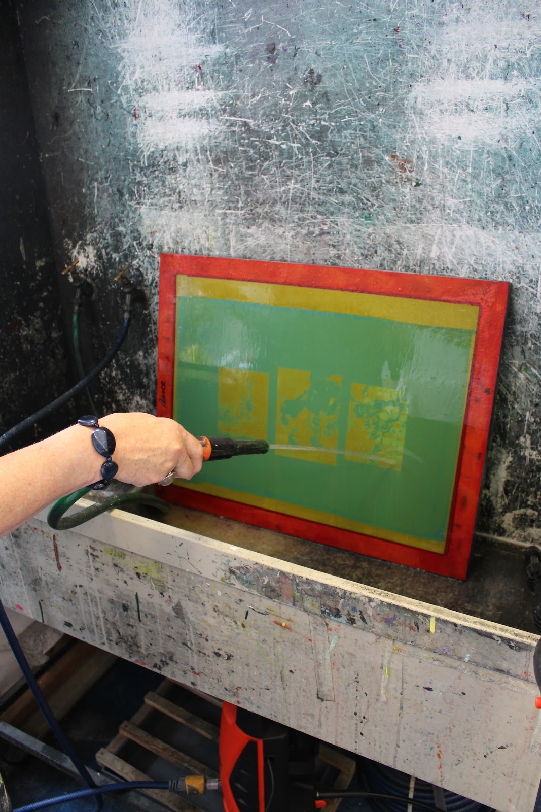
Particpants will learn how to make a photo-stencil by coating silk screens with photo-sensitive emulsion, exposing their own designs onto the screens using an exposure unit and then washing out the designs.They will also use a vacuum bed and learn registration techniques to enable them to print a small edition of two colour screen prints. Hopefully there will also be time to take a look at contemporary screen printing and a selection of work by a few of my favorite screen printers.

If you ever want a screen printing class just let me know, karoline@chichira.com or failing that if you stand still for long enough I'll teach you to screen print anyway, whether you want to learn or not.

The International Alternative Press Festival

This weekend I'm making my annual pilgrimage to the International Alternative Press Festival, a mecca of all things self published including comics, zines, illustration and print. Alongside over 100 other exhibitors I'll be selling a selection of my hand printed cards, some mini prints, the last few Magic postcard books, Magic zines and also Obsession zines. It's a big event to organise and undoubtedly wouldn't happen without alot of hard work from a dedicated team of enthusiasts. My contribution is pretty small by comparison but it's good to know I've helped in some small way by printing a batch of International Alternative Press tote bags in a very nice metallic black fabric ink. Hopefully no one will notice the 2nd is actually missing from the 2nd International Alternative Press Festival because I'd quite like to be invited back to do the 3rd International Alternative Press Festival.

 The 2nd International Alternative Press Festival
Saturday 4th & Sunday 5th August 2012
11am - 5pm
Conway Hall
25 Red Lion Square
London
WC1R 4RL
http://alternativepress.org.uk/

Monday 30 July 2012

Print, Print As Fast As You Can...


...You can't catch me because I'm the Gingerbread Man! I've printed another batch of these bad boys and they certainly are tricky little fellows to get right. The registration has to be fairly accurate added to which printing metallics is difficult because they tend to block the screen mesh quicker than regular inks. Probably not the best thing to print on a hot summers day.

Good Enough To Eat

I was wondering what to do with a stack of lovely yellow recycled card I ordered a while ago. Finally I decided to reprint my old 'Cakes Versus Fruit' design which was originally produced as a gocco print. It is true to say that 'Cakes Versus Fruit' is a constant dilemma in my life and unfortunately the cakes usually win. I like to think that a few hours screen printing actually helps to burn off the extra calories but who am I kidding?

Friday 6 July 2012

More Folk Art


Over the last couple of months I've been working hard on some new Folk Art inspired designs for a group exhibition in London. I really wanted the chance to produce bigger silk screen prints, to experiment with coloured backgrounds and to use good quality printmaking paper. It took me alot longer than expected to both draw and print the designs, believe it or not it was actually the first time I'd done A3 screen prints. Luckily my efforts weren't in vain and a framed copy of 'Folk Tree at Night' sold at the private view as well as some of the unframed prints.

You Are My Sunshine


I should really be fed up of my 'You Are My Sunshine' design as I've been printing it since January 2010 but it's still one of my favorites. And as if the cards aren't enough there are also different sized 'You Are My Sunshine' silk screen prints, so all in all this design keeps me pretty busy.

A little bit of Magic

The Magic zine and colouring book is still one of my favorite publishing projects and it features allsorts of talented illustrators including Ruth Green, Mina Braun, Beth Morrison, Helen Entwisle and Sarah Lippett. I drew a series of Hopi Indian Kachinas for the Magic Zine and the cover was drawn by Gemma Correll. There is also a colouring book cover which was designed by Kate Hindley. I've lost count of how many covers I actually screen printed, it seemed to take forever but was worth it in the end because both designs look great. The inside pages were beautifully litho printed in dark green by Tuckey Print in Birmingham.

Endangered Species

Believe it or not I don't just make greetings cards, although it often seems like it. When I get the time I like to work on publishing projects and enjoy collaborating with other women illustrators to produce limited edition postcard books, colouring books and zines featuring our illustrations. 'Endangered Species' is the most recent example and contributors include Kate Hindley, Gemma Correll, Ruth Green, Beth Morrison, Mina Braun, Helen Entwisle and myself. Mina designed the colouring book cover with the panda and Helen drew the zine cover with the african wild dog. I then screen printed about 600 of the covers, which I don't recommend as it took approximately 6 days.The inside pages were litho printed by the nice people at Tuckey Print in Birmingham who also collated the books.

Yummy Mummy


I don't like traditional sentiments so always try and come up with more original ideas for traditional occassions. These 'Yummy Mummy' designs were created for Mother's Day but it was really just an excuse to draw more pictures of food. It's hard to say which I like more, eating, drawing or printing, I couldn't live without any of them.